Mountain Pet Company
A freelance brand and storefront for a Nepali exporter of Himalayan yak-milk dog chews — a genuinely unusual product that had to look credible to American pet owners.
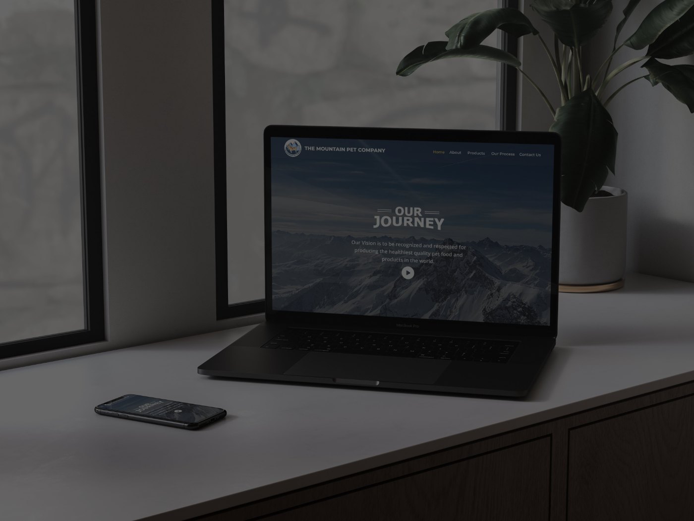
THE MOUNTAIN PET COMPANY — DESKTOP AND MOBILE
Sell a product most buyers have never heard of.
A Nepali institution with a long export history in hard, dried yak-cheese dog chews needed a site for the US market. The product is all-natural, low-lactose, high-protein and hand-made by Himalayan farmers at 15,000 feet — none of which means anything to a shopper who has never seen a yak-milk chew.
So the site had two jobs: make an unfamiliar product feel safe to buy, and make its origin the reason to buy rather than a curiosity.
Audit the shelf the client wants to stand on.
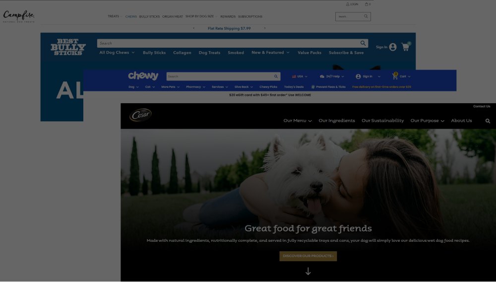
Before designing anything I audited the US competitors the client would sit beside — Best Bully Sticks, Chewy, Cesar, Campfire — and found a consistent pattern: dense navigation, heavy promotional messaging, product-first photography, and almost no story about where anything comes from.
That gap set the strategy. Competing on catalogue depth or price against Chewy was not winnable; competing on origin was, because nobody in the category was doing it.
Four calls that made provenance the product.
Everything visual points at the same claim: this is made by hand, high up, by people who care about the method.
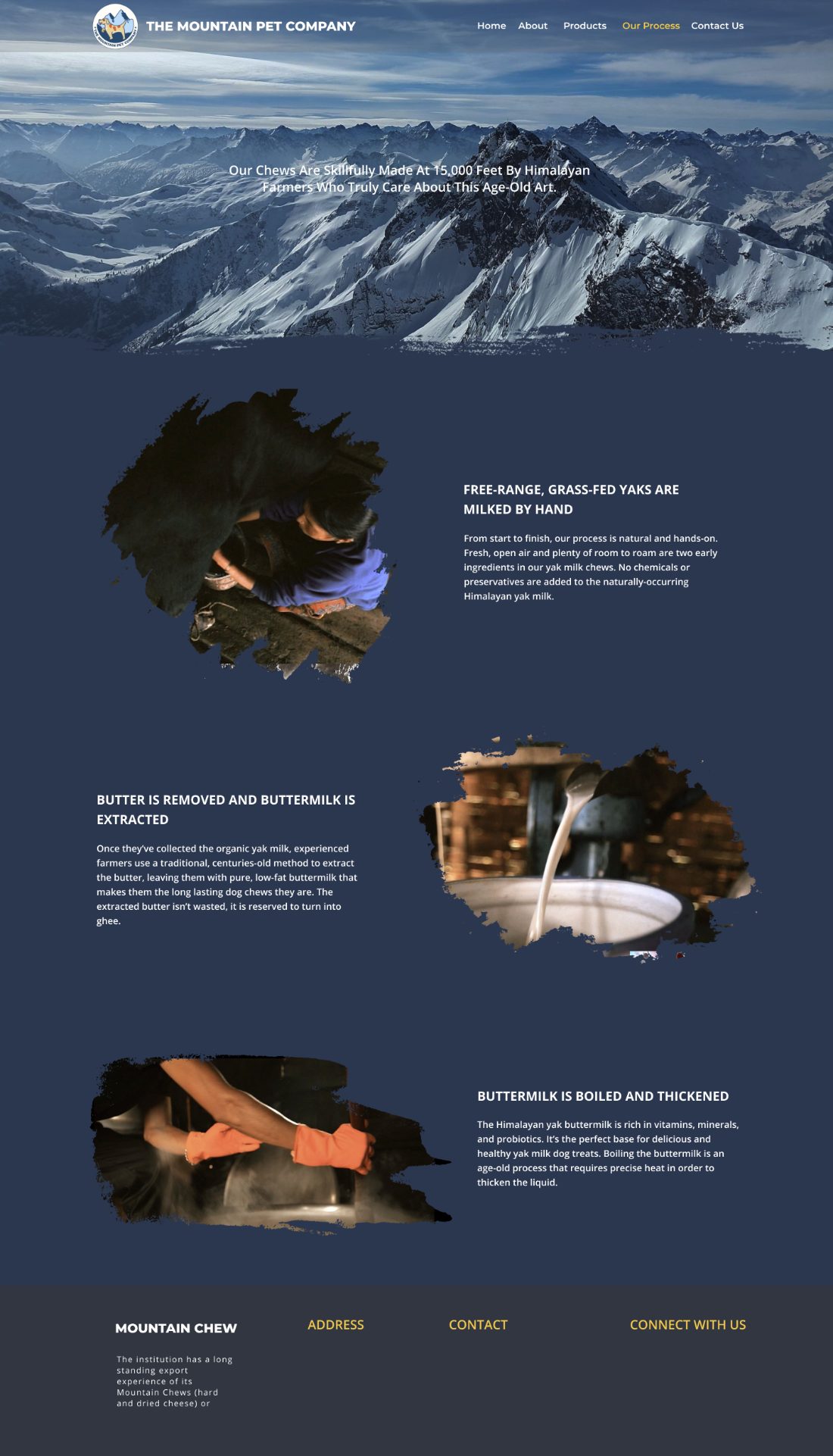
The process page carries the whole story.
Milking, butter extraction, boiling and thickening — four steps, four rows, each with its own photograph and plain-language explanation. No jargon, no marketing adjectives; the method is impressive enough stated plainly.

Designed and built single-handed, QA'd before handover.
I built the site responsive from my own designs, then ran a full pass of cross-browser and visual QA before client handover — the part of freelance work that decides whether you get referred.
Outcome
Delivered as a responsive brand and product site for the US market, QA'd across browsers and handed over to the client with the content structure their team could maintain.
My role
Sole freelance designer and front-end developer — competitor research, UI design, responsive build and QA.
Reflection
The competitor audit is what stopped me designing another bright, promotional pet store. Finding the one axis a small producer could win on, then building every visual decision — palette, masks, type, scroll order — to serve that single argument, is the part of this project I would still defend today.