Base Superadmin
A white-label analytics portal for a platform that had grown into a dozen disconnected microservices — one place for the company and every client to see what was actually happening, under their own branding.
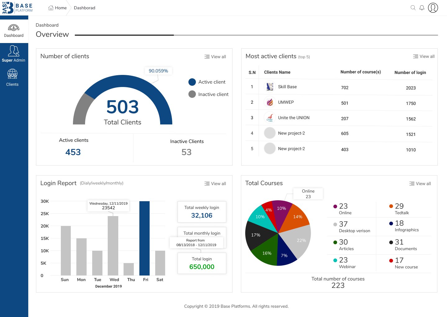
SUPER ADMIN OVERVIEW — CLIENT COUNTS, LOGIN REPORTING AND COURSE MIX IN ONE VIEW
A platform with no single place to see itself.
The product had grown into a set of separate sub-applications and microservices. Each did its job, but neither the company nor its clients had one view of what was happening across the platform.
The brief: an admin portal giving both sides a graphical view of their data — and the ability to act on it, not just read it.
Start from the questions clients ask every week.
I worked out what clients actually needed to see and do: how many of their end-clients were active, how many had recently signed up, how many courses sat against their account — and the recurring weekly and monthly reporting they were assembling by hand.
That set the information hierarchy before any chart was chosen. The dashboard answers those four questions above the fold; everything else is a drill-down.
Wireframes and an information hierarchy signed off before any UI.
I built low-fidelity wireframes of the overview, the client list and the drill-downs, and took them through management sign-off before visual design started — so the argument about what deserves the top of the page happened in grey boxes.
Tokens, not a palette — because every client arrives with their own brand.
Each client needed the portal under their own branding. Rather than design a fixed palette, I documented the interface as design tokens with a single adjustable accent driving buttons, charts, active states and focus rings.
Swapping in a client brand colour and logo never required touching an individual component — and no future colour could break a layout I had already shipped.
Auth, dashboard and mobile — one system, three densities.
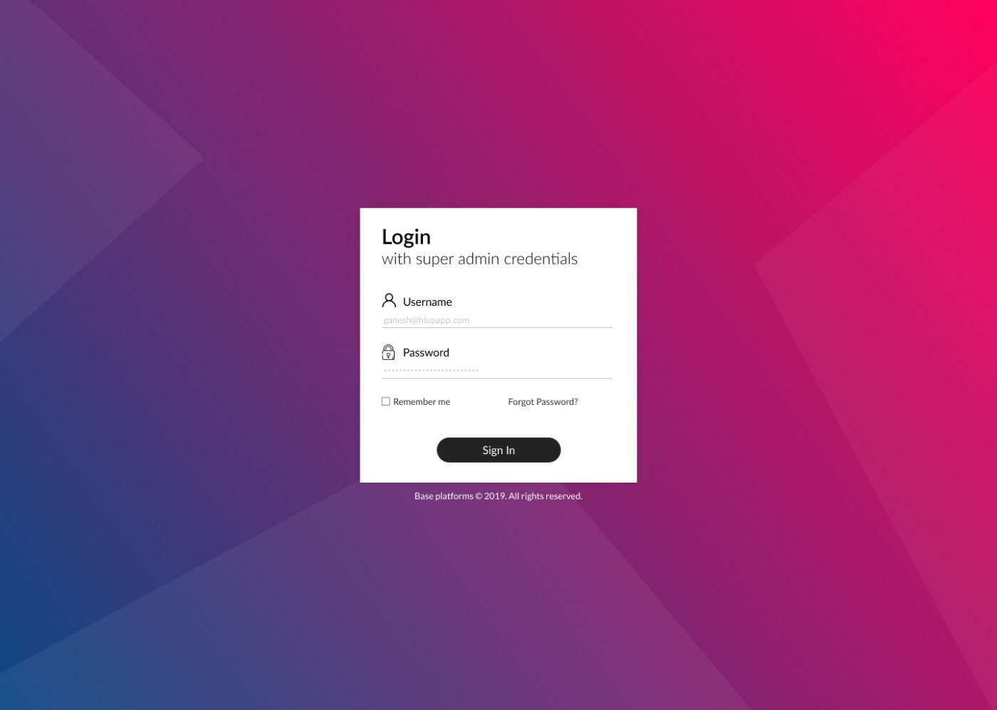
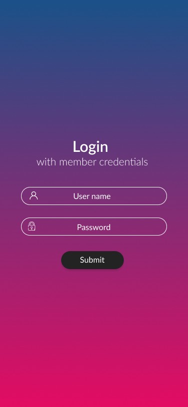
The login screens carry the brand gradient and nothing else; the dashboard is dense and quiet so the data is the only thing with colour. Same tokens, opposite treatment — which is exactly what the white-label model needed.
Handover as React components, with a junior designer alongside me.
I worked with the development team on converting the designs into React components with SCSS as the styling layer, mapping each token to a variable so the theming promise held in code and not just in Figma.
Part of the role was mentoring junior designers through that same conversion, so the design-to-code handover didn't depend solely on me.
Outcome
Launched as the central portal for the company and its clients, with white-label theming, activity dashboards and generated weekly and monthly reports.
My role
UI/UX Designer and Product Owner. I owned the interface end to end, from wireframes through final UI, and mentored junior designers on implementing it in React and SCSS.
Reflection
A single adjustable accent instead of a fixed palette was a small decision with an outsized effect on how far ahead I had to think. It is designing for a system rather than a screen — and mentoring others through the same discipline forced me to formalise rules I had been applying instinctively.