HIUP Solutions
A company marketing website doing three jobs at once — explain the business, let team members publish, and post vacancies — with no developer needed for routine updates.
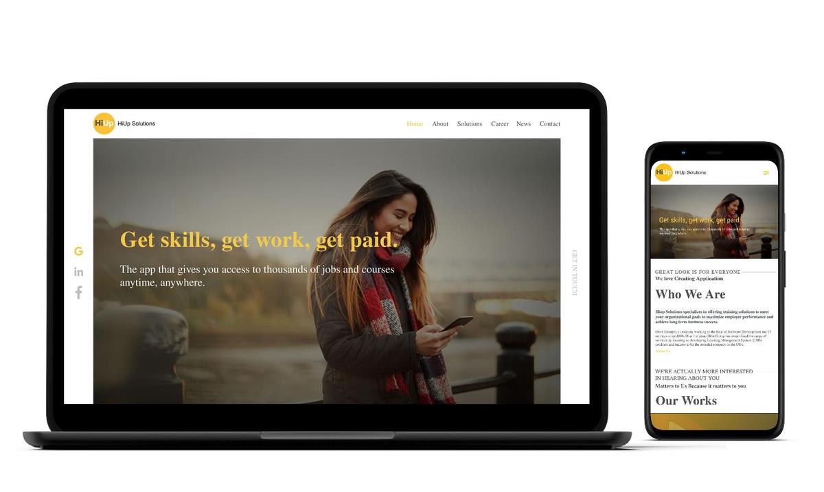
HIUP SOLUTIONS HOMEPAGE — DESKTOP AND MOBILE
Three audiences, one site, and nobody technical to run it.
HIUP needed a site that explained who they are as an IT company, let team members publish their own articles, and let HR post vacancies — all without a developer involved for routine updates.
Requirements from the people who would maintain it.
I gathered requirements directly from the CTO and the admin team: what the site had to communicate, and who would be maintaining it day to day.
That conversation produced the constraint that shaped everything else — the platform choice and the content structure both had to be usable by non-technical staff, so both were decided before a single screen was designed.
A sitemap that matches how visitors look, not how the company is organised.
Before any visual design I mapped a simple sitemap — home, about, solutions, career, news, contact — so the WordPress content model mirrored how a visitor actually searches for information rather than the company's internal structure.
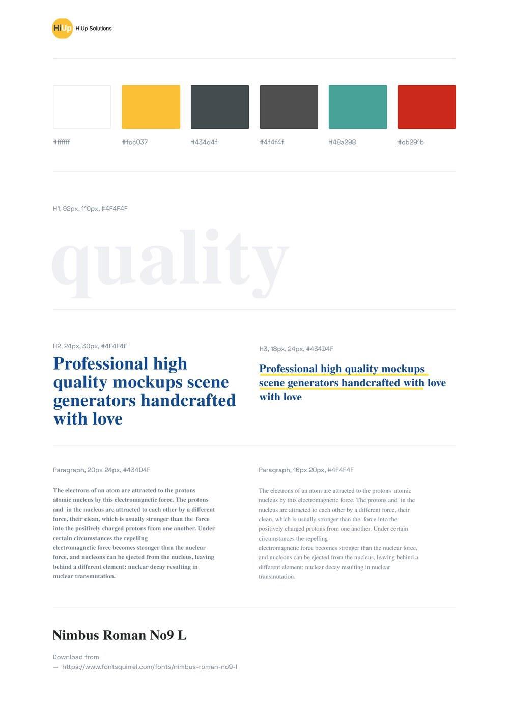
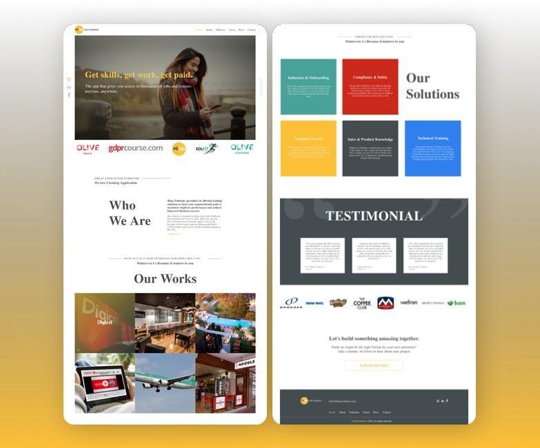
I then produced a mockup and a full style guide: a defined colour palette, a type scale across headings and body, and a chosen typeface — so anyone extending the site later, including someone other than me, had a system to work from rather than ad hoc decisions per page.
WordPress, chosen for the maintenance model.
We built on WordPress specifically so the maintenance model would work: admins add and edit page content, HR posts vacancies, and team members publish their own articles — none of them touching code.
Outcome
Launched as HIUP Solutions' public marketing and careers presence, with self-service content management for admins, HR and team members.
My role
UI/UX Designer. I led requirements gathering with stakeholders and produced the sitemap, mockups and style guide the build was based on.
Reflection
A smaller project, but a good example of a constraint that is not visual at all — deciding who maintains a site after launch — shaping the technology choice before a screen existed. Sitting with the CTO and admins to understand their real workflow is what made the platform decision the right one rather than the easy one.