In this project, I took on the responsibilities as the sole contributor, assuming dual roles in both UX/UI design and WordPress website development. With a comprehensive skill set encompassing the intricacies of user experience and interface design, coupled with proficiency in web development using WordPress, I navigated the project from inception to completion with meticulous attention to detail.
Throughout the project, my approach was characterized by adaptability, creativity, and a relentless commitment to excellence. As a solo player, I embraced the challenge of wearing multiple hats, seamlessly transitioning between design and development tasks to deliver a cohesive, integrated solution that exceeded the client’s expectations.
Problem
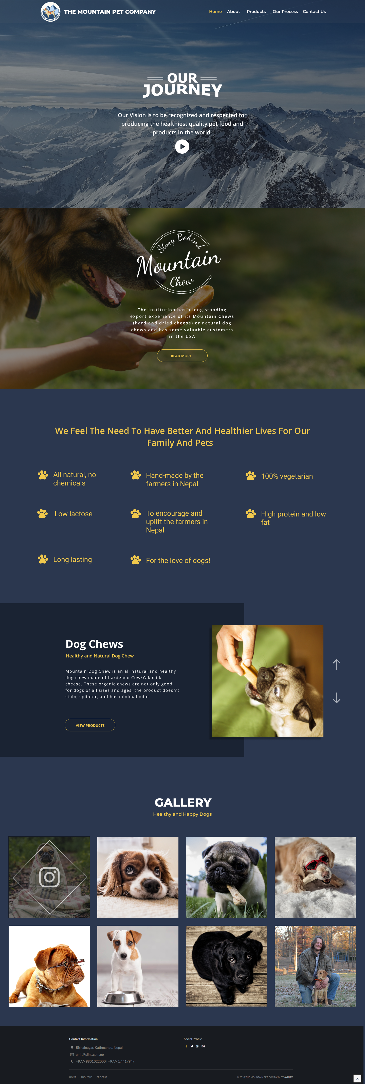
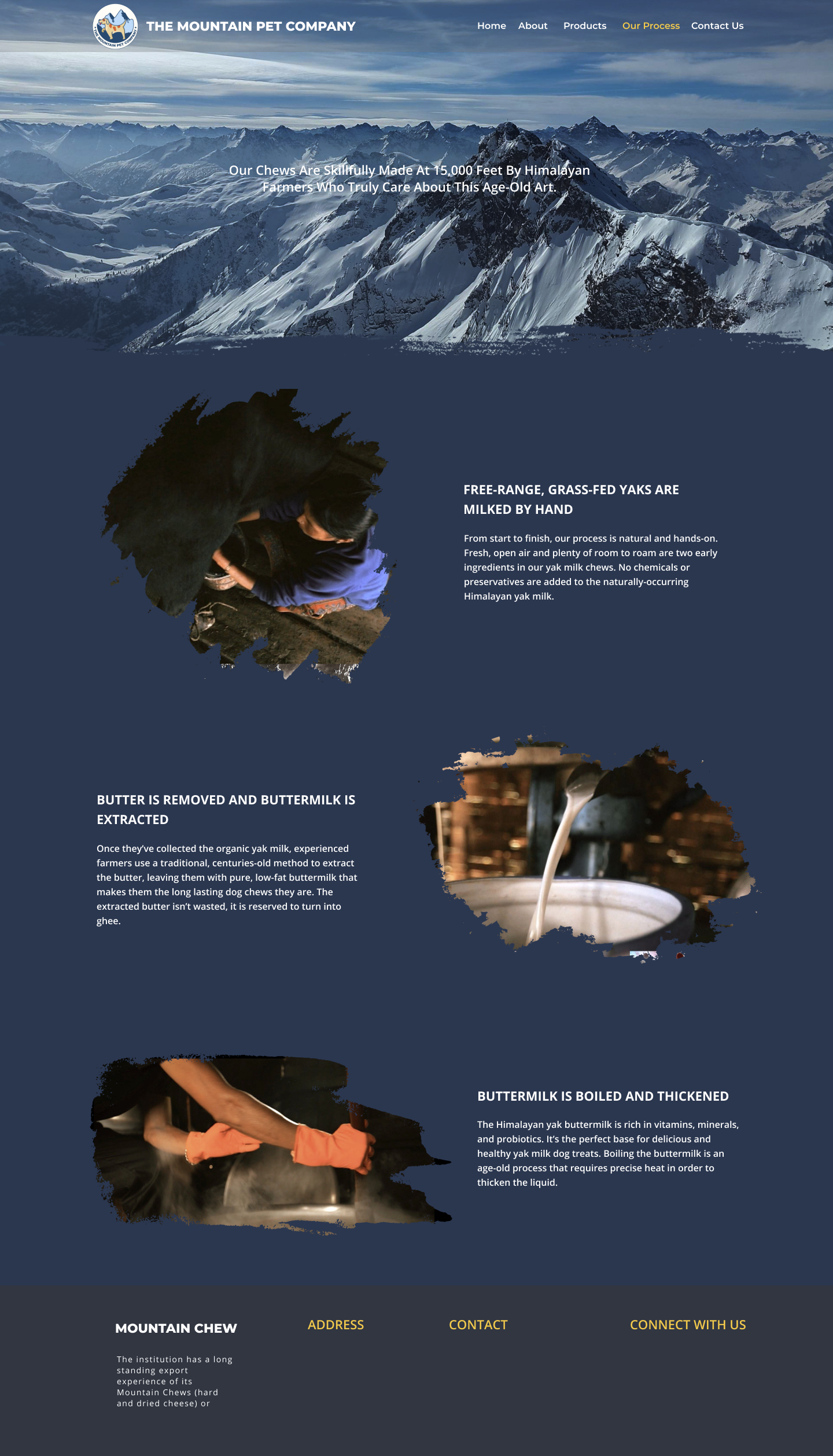
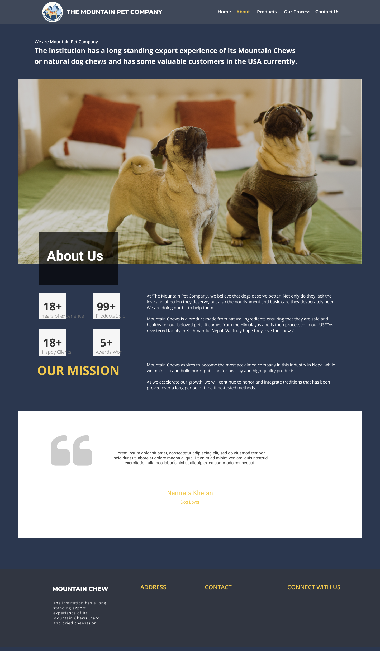
Despite significant traffic generated via paid promotions on platforms such as Facebook, Instagram, and google ads, the client has observed limited conversion in terms of actual sales through the website. Consequently, there is a pressing need to optimize the website to effectively drive sales and achieve the client’s business objectives.
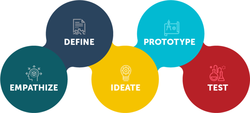
Process
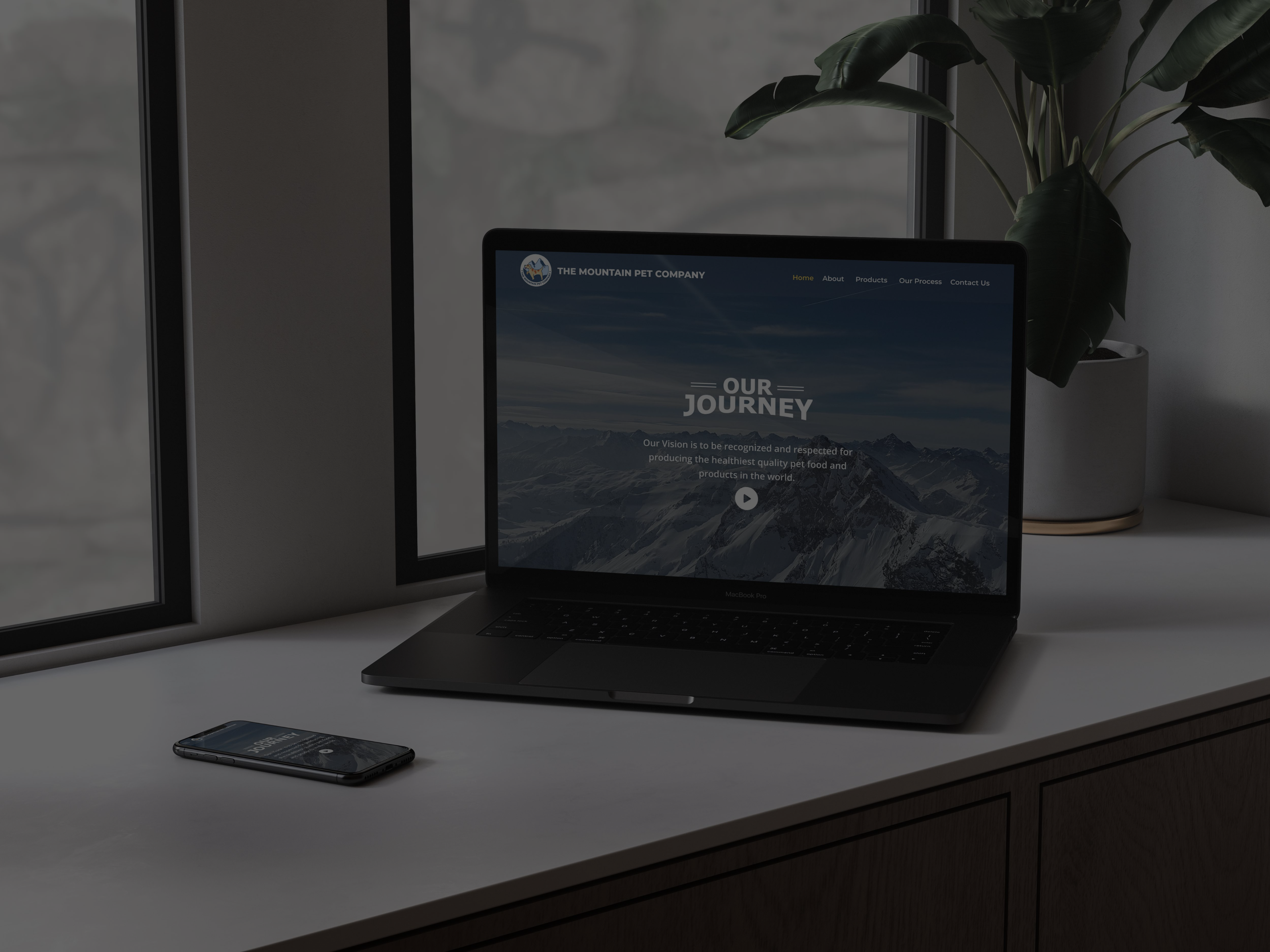
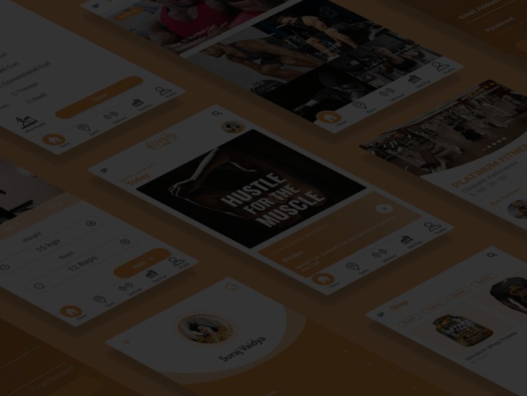
The project was slated for completion within a 2-month timeframe, encompassing both development and implementation phases. To kickstart the process, a series of comprehensive interviews and meetings were conducted with stakeholders and managers to gain deeper insights into the site’s workflow and strategic objectives. A primary aim of the project was to elevate the website’s aesthetics to exude a premium feel while simultaneously enhancing user experience to streamline product browsing and ordering processes.
In order to gain a nuanced understanding of user behavior and identify key areas of focus, I utilized the Hotjar plugin to conduct detailed surveys and analyze user interactions on the website. This data-driven approach allowed for the identification of critical pain points and obstacles hindering users from completing their orders effectively.
Subsequently, strategic measures were implemented to incentivize user engagement and drive conversions. This included the creation of a user signup form on both the website and Facebook page, offering participants a compelling 20% discount on their next purchase as part of a promotional campaign. Leveraging this opportunity, I curated a series of meticulously crafted questionnaires aimed at eliciting feedback on user experiences, preferences, and browsing habits across various platforms. These questionnaires were administered both in-person to immediate users who participated in the signup process, as well as to a wider audience including the client’s network of friends and associates.
By amalgamating insights garnered from user surveys, interviews, and data analytics, we were able to formulate targeted strategies aimed at optimizing the website’s functionality, enhancing user satisfaction, and ultimately driving increased conversions and sales.
Findings
The website faced significant usability challenges, resulting in user frustration and a high bounce rate. Key issues identified through user feedback and analytics include:
Slow Loading Times: Many users abandoned the website within the first minute due to prolonged loading times. This likely contributed to a negative user experience and deterred users from engaging further with the site.
Confusing Checkout Process: Users reported confusion and difficulty navigating the checkout process, which likely impeded conversion rates. A streamlined and intuitive checkout flow is crucial for facilitating seamless transactions and enhancing user satisfaction.
Perception of Incompleteness: The incomplete nature of the website raised concerns among users about its credibility and trustworthiness. This perception of being “unfinished” or “fishy” likely undermined user confidence and deterred potential customers from making purchases.
Lack of Mobile Responsiveness: With a significant portion of users accessing the website from mobile devices, the lack of responsiveness rendered the site inaccessible or difficult to navigate for a large portion of the audience. This not only contributed to a poor user experience but also hindered the website’s ability to effectively engage mobile users and capitalize on potential sales opportunities.
Addressing these challenges will require a comprehensive approach focused on optimizing website performance, streamlining the checkout process, enhancing credibility and trustworthiness, and ensuring full mobile responsiveness. By prioritizing these areas of improvement, we can work towards creating a user-centric website that effectively meets the needs and expectations of our target audience, ultimately driving increased engagement, conversions, and customer satisfaction.
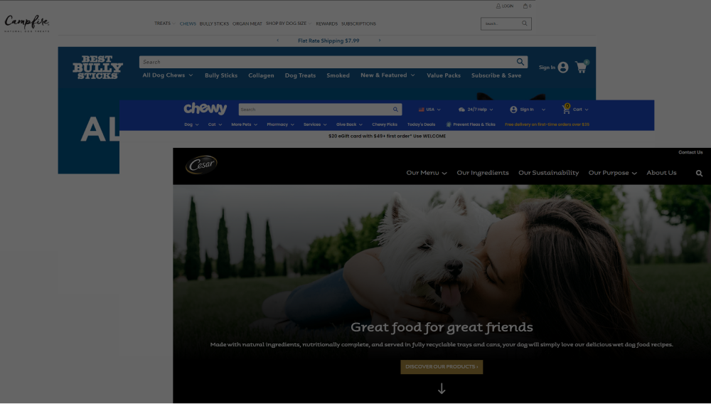
Competitive Analysis
In addition to analyzing user behavior and feedback directly on our website, I conducted thorough research on other platforms within our industry niche. By examining how these competitor websites organized their sections and facilitated user interaction, I gained valuable insights into industry best practices and user expectations.
To further validate these findings and gauge user perceptions, I enlisted the help of volunteer users to perform tasks on our website that mirrored those on competitor platforms. This hands-on approach allowed me to observe firsthand how users interacted with our site and identify areas for improvement.
Additionally, I prepared a comprehensive questionnaire to gather feedback from volunteer users regarding their experiences on both our website and those of our competitors. By comparing and contrasting user responses across different platforms, I was able to pinpoint specific features and functionalities that resonated most with our target audience and areas where our website could be enhanced to better meet user needs and preferences.
This multi-faceted research approach, encompassing both qualitative and quantitative methods, provided invaluable insights that informed strategic decisions aimed at optimizing our website’s design and functionality to drive user engagement and satisfaction.
139
Models Shot
52
Happy Clients
623
Sunsets Captured
Most users would not even stay more than 1 minute on the website as it took too long to load.
They were confused about how to checkout.
Some users also said that as the website was incomplete it looked fishy to order from them.
70% of the users were from mobile devices and the website was not completely responsive.